02-10

IndiGo Airlines

IndiGo Airlines is a prominent player in the aviation industry, committed to providing top-notch services to its passengers. This case study focuses on the transformation of the IndiGo mobile app’s user experience, enhancing the booking process, check-in procedures, seat selection, and real-time access to flight information. The existing app faced significant user experience challenges, including accessibility, consistency, system status visibility, and a lack of visual hierarchy.

Product Designer
2018
UX Audit & Research
Wireframing
User Experience
UI Design
Prototyping
Myself

Problem Statement

The current airline booking app lacks a user-centric approach, resulting in a subpar booking experience. Key issues include:
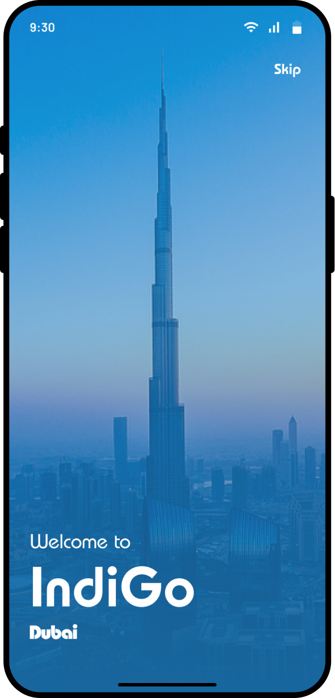
  • Splash: Missing emotional connection and inconsistent design.
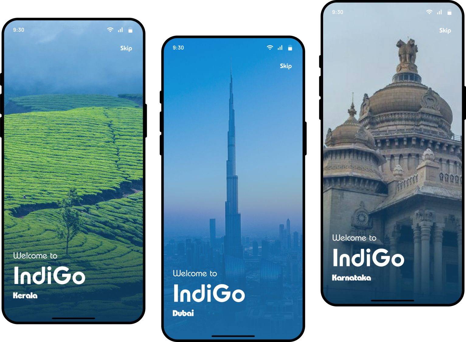
  • Onboarding: Lacks user control due to the absence of a Skip button.
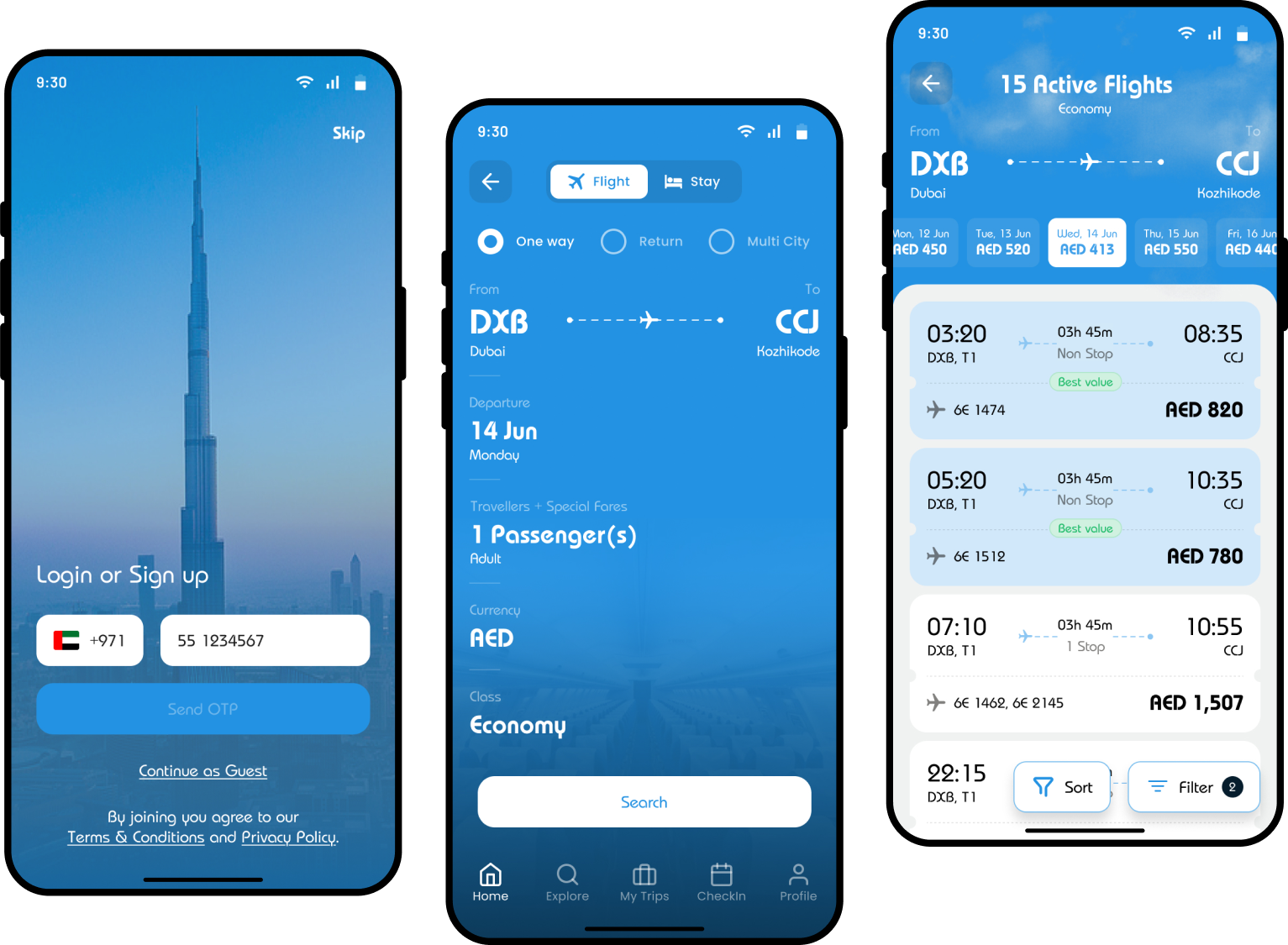
  • Landing: Overwhelming amount of information and unnecessary scrolling, distracting from the primary action of searching for flights.
  • Search Results: Poor organization, lack of visual hierarchy, and inconsistent placement of information.

Impact

  • Users feel disconnected from the brand due to missed opportunities to build trust and emotional connection.
  • Increased frustration and inefficiency during critical booking tasks.
  • Reduced usability and potential abandonment of the app.

Goal

To create a smooth, fast, and user-centric booking experience that strengthens emotional connection and trust, ensuring users can efficiently achieve their booking goals.

Solution

Splash

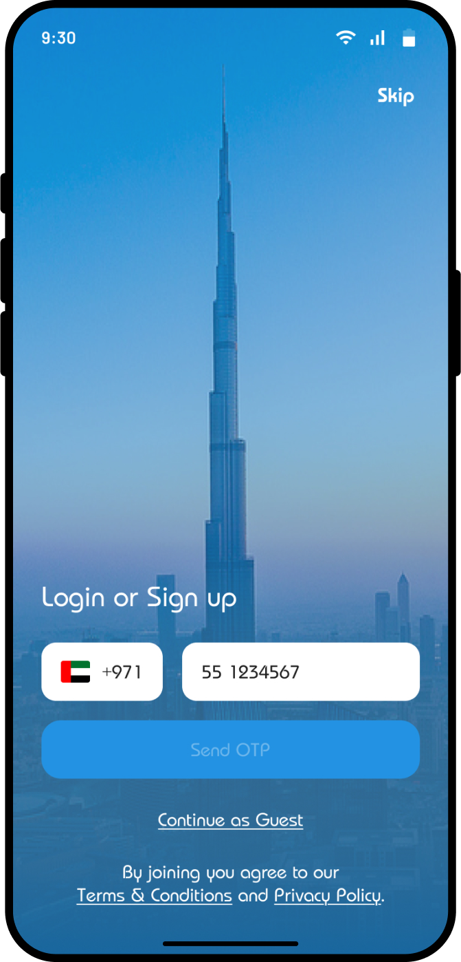
  • The splash screen has been improved by introducing a simple, welcoming design to create a positive first impression. A localized and personalized feel has been added by featuring a famous city landmark, as shown in the High-Fidelity Mockups. Branding consistency is ensured with uniform fonts and cohesive visuals.

Onboarding

  • Added a Skip button for enhanced user control and flexibility.
  • Removed redundancy by streamlining functionality.

Landing

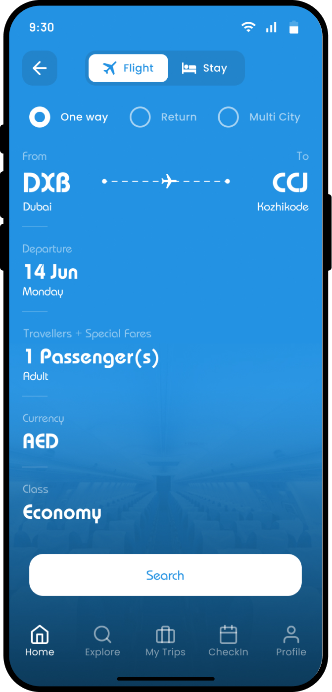
  • Reduced information overload by prioritizing the Search for Flights action.
  • Minimized unnecessary scrolling to focus on user needs.

Search Results

  • Improved visual hierarchy and organized information for better readability.
  • Grouped related details to streamline decision-making.

Process

Research

  • Conducted a competitive analysis of airline and travel apps to identify strengths and weaknesses.
  • Evaluated user pain points and areas of improvement in the current app.

Design

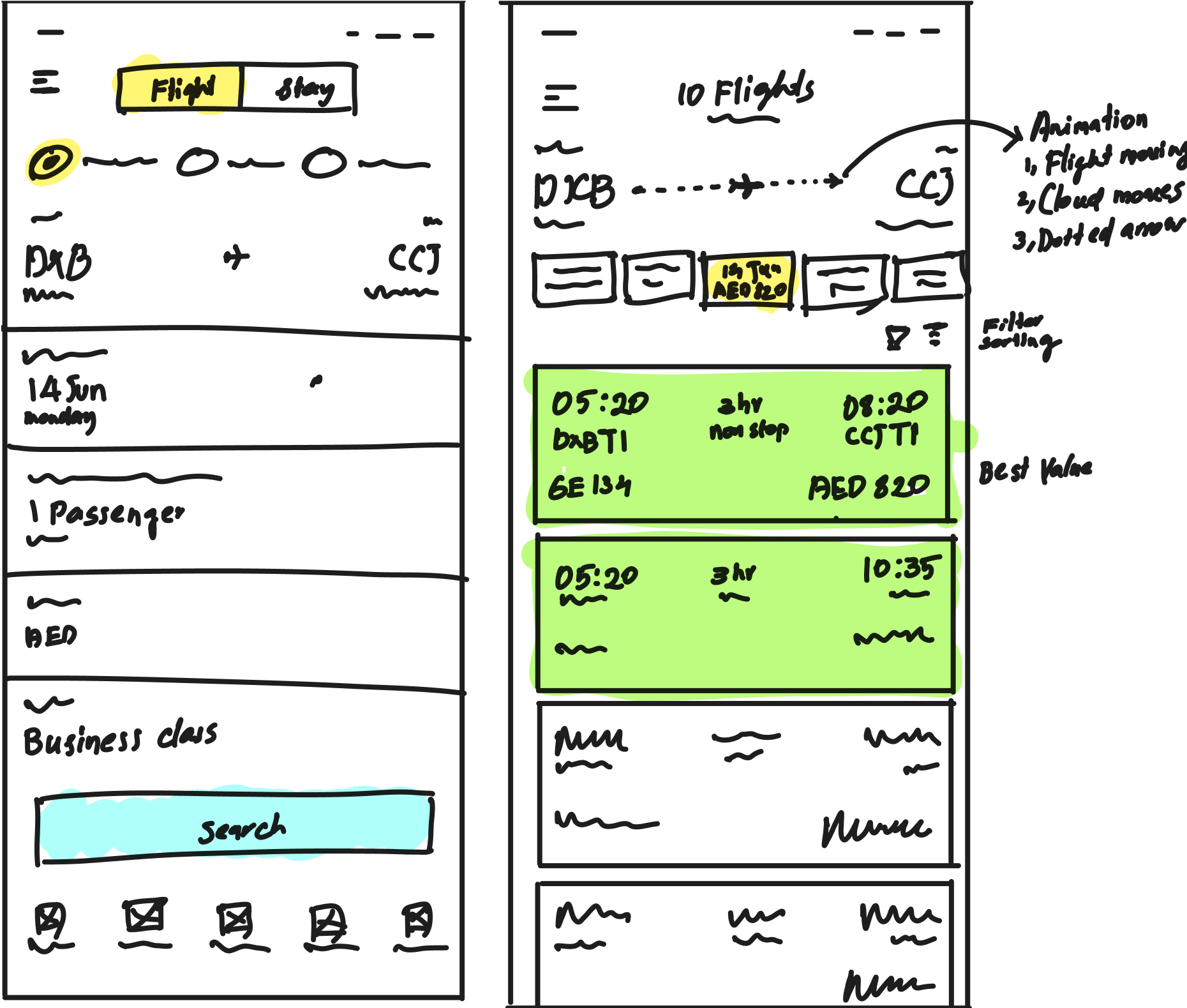
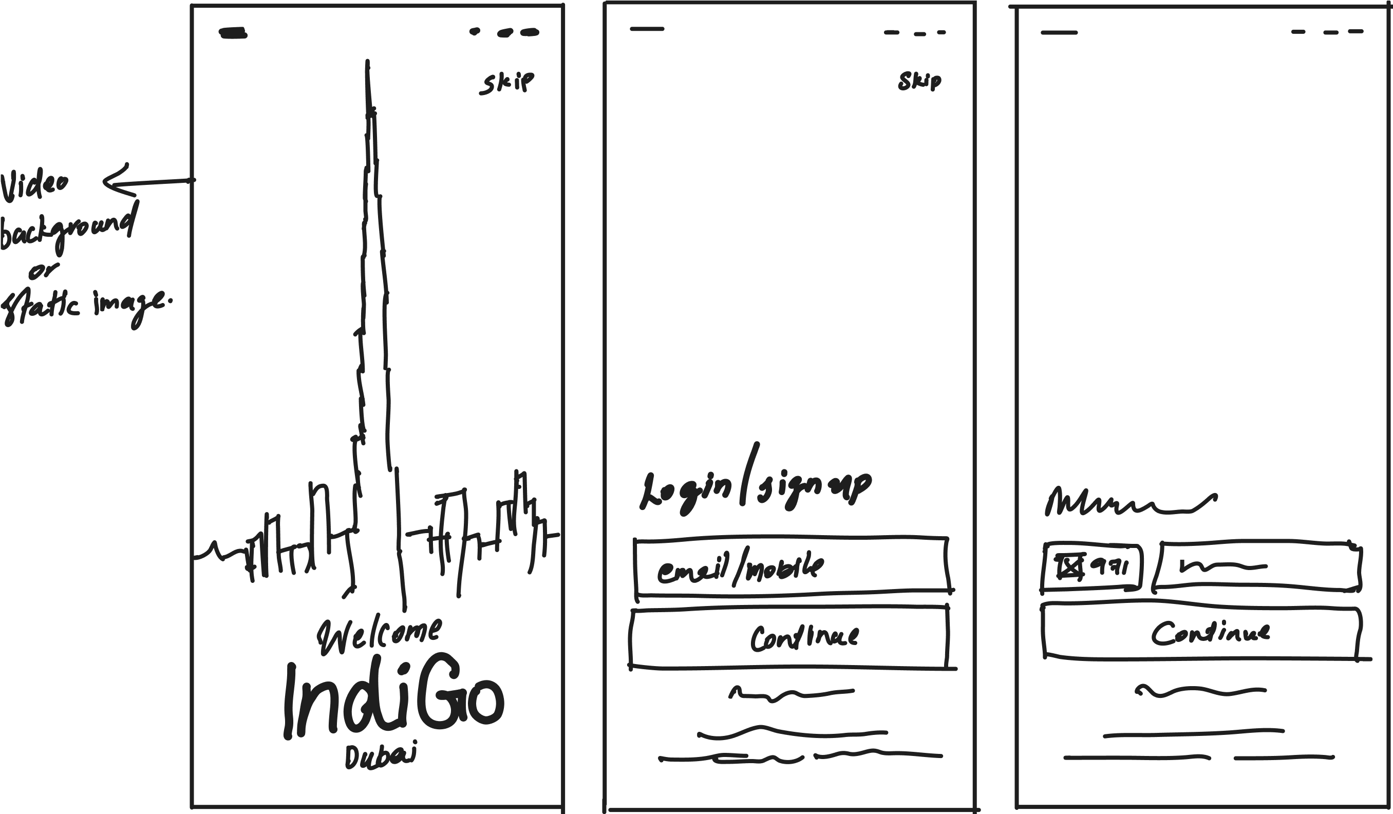
  • Wireframing: Developed low-fidelity layouts to conceptualize solutions.
  • Iteration: Refined wireframes based on usability feedback.
  • High-Fidelity Mockups: Created polished designs showcasing visual improvements.
Research & Audit
User Research
User Interviews
Usability Testing
Affinity Mapping
Heuristic Evaluation
Competitive Analysis
Design
User Experience (UX) Design
User Interface (UI) Design
Design Systems & UI Kits
User-Centered Design (UCD)
Visual Design
OS Design
Design Thinking
Product Strategy
Heuristic Analysis
Interaction Design
UX Audit
User Journeys
User Flows & Personas
Information Architecture
Affinity Mapping
Wireframe & Prototyping
Design Sprints
Data-Driven Design
Coding
HTML
CSS
Sass/Less/Compass
Bootstrap
Frameworks
Happy to hear from you